Choose Your Booth’s Colors Wisely, Consumers’ First Impression Depends on It
Before a visitor reads your logo, understands your product or speaks to your team, they see one thing first. Color.
In the fast paced environment of exhibitions and trade shows, attention is earned in seconds. The colors you choose for your booth can either draw people in instantly or let them walk right past.
Color is not decoration. It is strategy.
Why Color Matters More Than You Think
Different colors trigger different emotions and behaviors.
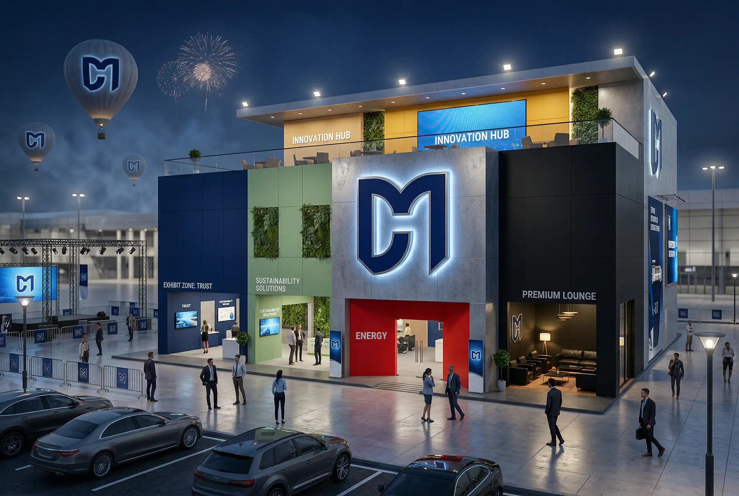
Blue communicates trust and reliability.
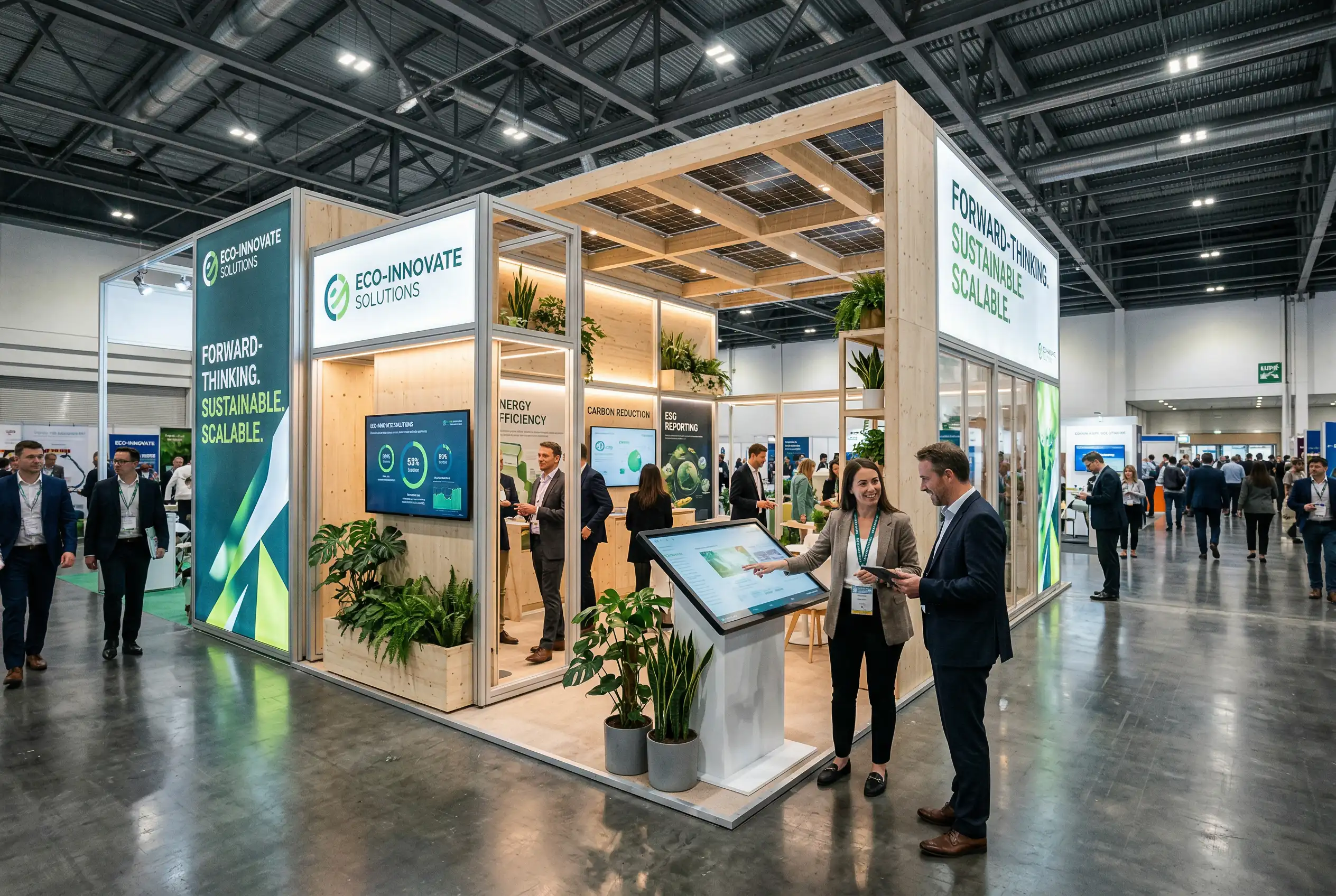
Green suggests sustainability and growth.
Red creates urgency and excitement.
Black signals luxury and authority.
Yellow attracts attention and conveys optimism.
The wrong shade can confuse your positioning. The right one can strengthen it instantly.
It Is Not Just About Standing Out
Many brands think bright equals visible. But visibility without alignment can feel chaotic. Your booth colors must reflect your brand identity, your industry and the message you want to communicate.
A premium brand should feel refined and intentional.
A tech brand should feel clean and innovative.
A wellness brand should feel calm and natural.
Color psychology plays a powerful role in how people perceive value, credibility and quality.
Consistency Builds Recognition
Your booth should feel like a physical extension of your brand. When your color palette aligns with your logo, packaging and marketing materials, you create instant recognition and trust.
In crowded exhibition halls, familiarity is powerful.
Design With Intention
At Dynamic Motion, we approach booth design strategically. Color selection is not a last minute aesthetic choice. It is part of the overall experience design, ensuring that your stand communicates the right message before a single word is spoken.
Because in the world of events, first impressions are not just important. They are everything.